How often do you hear somebody talking about “photoshopping” an image? It often seems that in this case, people either don’t really know what you can do with Photoshop, or what it is usually used for.
Well, in any case, a fun way of using Photoshop (and GIMP and the other programs) is colour matching. This basically means the following: Take your lame picture, and also take an amazing picture of some famous artist / painter that really knows his stuff (about colours) and finally use least squares (or the likes) to match the colours of the kick-ass image to your lame-ass image.
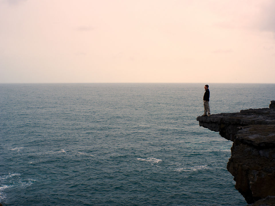
About two years ago tried this technique on the above photo, which in itself was pretty much grey-in-grey. The picture I “stole” the colours off was the rather famous and mindboggling Wanderer über dem Nebelmeer (“Wanderer Above the Sea of Fog”) by Caspar David Friedrich.
There you go, Ulf, another technique to spice up washed out pictures ;-)
Lol, that might be some technique ;-)
While the clock-synchronisation trick is a pretty important and handy one, there are hundreds of factors influencing the colours. I assume, beyond exposure, the other very immediate one is the (auto)white-balance, i.e. how do different automatic modes judge the general colour temperature of a scene. Then there’s also the actual colour profiles of the cameras themselves.
If you want accurate colours for everyone, the solution would probably have to be: shoot all pictures in RAW and create (and then use) custom colour profiles for each of the cameras (using colour checker charts and e.g. Adobe’s DNG profile creator). That’s what the pros do, when they need very accurate and faithful colours (especially for instance in product photography).
Another important link in the chain is colour management of your screen, but that’s a whole different story… I shall elaborate on this some more in later posts.
You know what I just thought about:
Why don’t I just take one of those kick-ass-paintings and apply the colors from my lame camera? :-)
As a more serious application: Whenever we’re traveling in a group we synchronize the clocks of our cameras so that we can copy all the pictures together after each journey.
Now, what we haven’t done so far is adjusting the color settings of different cameras. I’m always astonished how different cameras (in tourist-automatic-mode) can really take completely different pictures of the same scene. Your color matching technique could help getting rid of these problems.